
Exploring directions
We tested two visual directions across print, landing page and social before narrowing to three core services.
1
Version 1: colour-blocked headlines
Each key word set in its own solid colour tile over the photography, bold and easy to scan from a distance.
2
Version 2: editorial type
The full tagline set large, directly over the image, for a cleaner and more confident feel.
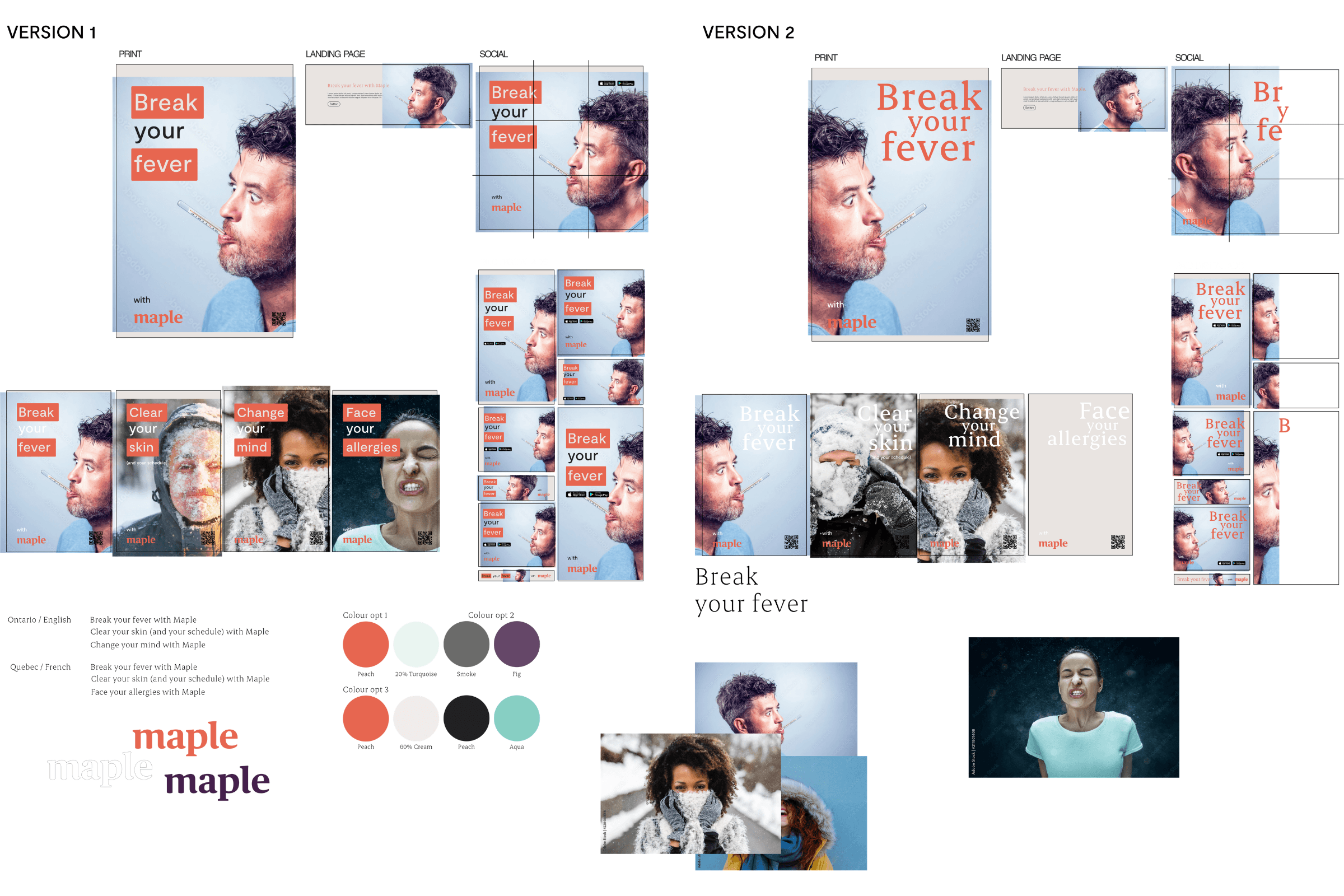
Two directions tested across print, landing page and social: colour-blocked headlines on the left, larger editorial type over photography on the right.
One idea, two provinces
The chosen direction became a breadth-of-services system built on the tagline, a cream background and bold colour-blocked type, with Maple’s sub-brands carried throughout. In Québec, mental health was swapped for RAMQ-covered allergy care.
Ontario • English
GP
Dermatology
Mental Health
Carried by Maple, skin by Maple and mind by Maple.
Québec • French
GP
Dermatology
Allergies
Carried by maple santé and ma peau par maple.

Subway takeover posters, English

Subway takeover posters, French
Where it ran
Production moved to another designer after the concept phase, but the system was built to stretch across every format.
Formats
Subway takeover posters
Horizontal car cards
Instagram 9-tile grid
Social carousel
Online banners

Left: Instagram 9-tile grid, 1080 × 1080. Top right: Facebook and Instagram carousel, 1080 × 1080. Bottom right: online banner.
